Created: 2017
Industry: Entertainment and secondary ticket market
Product: Email design layout, responsive and informational card layout system, feature graphic
Goal: Build a customizable email template that can be sent to customers before their event in order to make their experience easier and more pleasant. Must be responsive and contain relevant information that a ticket buyer might need and want to know for the event they’re attending.
My Role: I was given a few suggestions about content that I could include in the email template such as weather reports, directions, nearby hotels, and nearby restaurants. With these ideas in mind, I visualized a responsive card system to display the information, while finding a way to feature the actual event in a creative and customizable way.
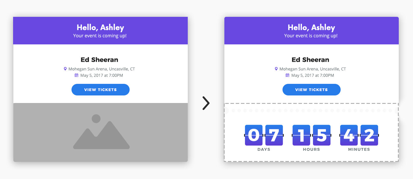
The Feature Card
The feature card had to include customer personalization; the event’s name, date, and location; a way to access tickets, and some other type of creative feature to attract attention. After laying out the text and CTA button for the main information, I decided to implement a countdown graphic. I created the design for it and passed off the assets and font information to the developers to make it actually function.
Weather Card and Icons
One of the additional information cards displayed the weather that the customer should expect on the day of their event. I set up the format of the date and temperatures and passed the specs off to the developers to code. My idea for this card also included weather icons, so I designed an icon set of all the possible forecasts.
The Final Mockups
The final layout that I set up for the Pre-Event ticket email successfully featured a responsive card system that displayed all the event information a customer might need in one place: event details, weather, directions, traffic updates, nearby restaurants, nearby hotels, and the ability to share it with friends. The overall design and colors reflected the TicketNetwork brand to keep it visually consistent with the rest of their emails. I added small colorful ticket stubs to the cards in order to highlight and differentiate each one. Finally, I handed off all the assets as well as the typography, colors, and spacing specs to the developers so they could turn my layout into a functional email.


